LUKE EDWARD HALL
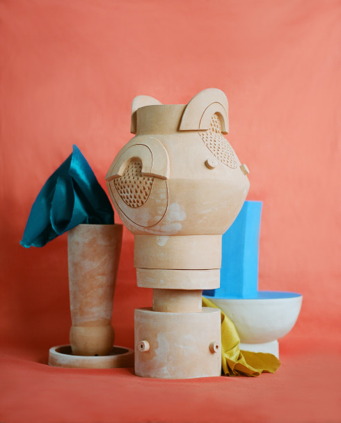
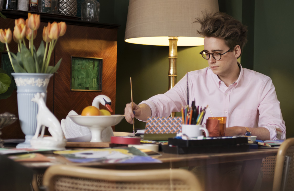
For Luke Edward Hall, the young British designer and artist, the impulse has always been to make things. As a child, that drive resulted in cardboard castles; as a teenager, it was fanzines and t-shirts. Now, at twenty-six, he is the creator of a passel of whimsical interiors as well as his own line of colorful housewares, and an illustrator whose drawings now appear in Burberry’s latest advertising campaign, accompanying photographs by Mario Testino. “I’ve been creating things from a young age,” Hall explains. “I’ve always been interested in lots of different disciplines, and how I might go about applying my æsthetic to them.”
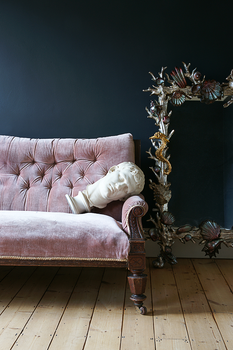
That æsthetic is, as Hall himself says, inspired by everything from classical sculpture to California’s sharp hues. “I’m inspired by the art and architecture of the ancient Greeks and Romans, the romantic nature of the English countryside, and the bright, vivid colors of midcentury Palm Springs,” he says. “Somehow I want to combine all of these things in my work, or at least these are the things I’m often thinking about when I’m working.”
Growing up, Hall was fascinated by magazines, which offered him the “first proper window into the worlds of fashion, art, and design” that he so comfortably inhabits now. It was in one of those publications that he first heard of Central Saint Martins, which he would eventually attend to study fashion communication before switching to menswear. “I’d never made a piece of clothing before, but it just sort of struck me one day that I wanted to do fashion design at Saint Martins,” he recalls, “and so that’s what I did!”
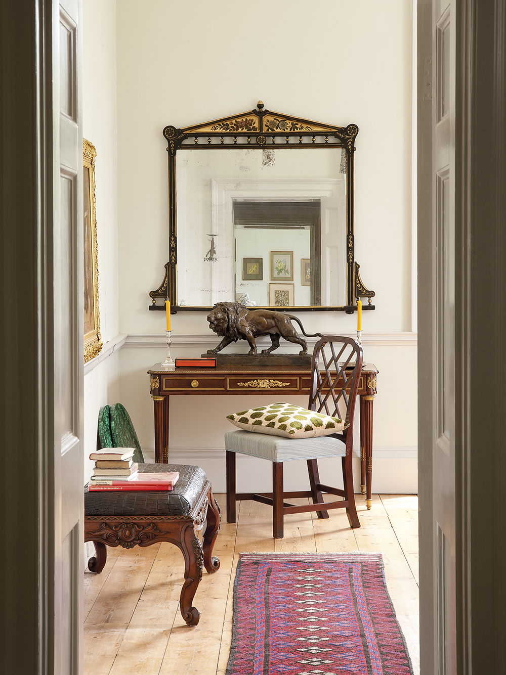
Those years learning to cut patterns and match fabrics have had a lasting effect on his work today, in the cheerily innocent prints on his pillows or the eclectic play of patterns, pigments, and mementos in his own home. “When designing these days, I’m still interested in the same things as I was when I was making clothes—mixing lots of different colors, textures, and prints,” he says. “When it comes to clothes, I like rather classic shapes, but what I’d always choose now is something colorful, or with an interesting, but not irritating, detail—funny buttons or contrast piping or something like that. For me, it’s the same for homewares and interiors. I like classic design—an old Howard armchair, for example, but I’d always want to upholster it in a fun, unexpected fabric.”
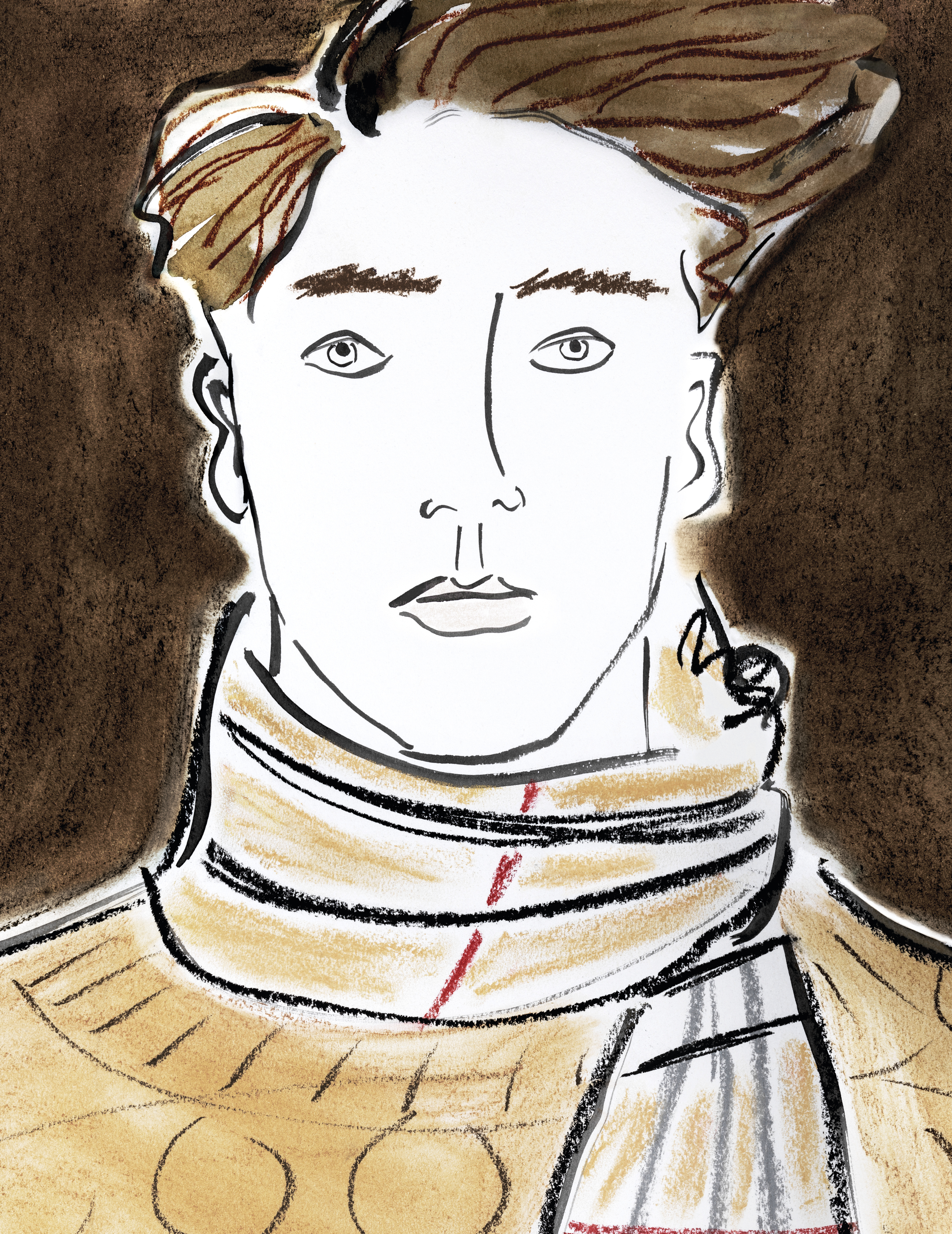
Hall’s illustrations are another throwback to his university days as well, a practice from his studies that he picked up again recently and which has added another dimension to his design work. His sketch of a bust of Apollo, for example, adorns a cushion from his line, while his drawings of martinis, ice cream cones, and dachshunds brighten up a series of pocket squares. His illustrations of models dressed in clothes and accessories from Burberry’s latest collection are an appropriately ingenuous twist on the standard campaign, reflecting the fashion industry’s growing fascination with young artists like Gustaf von Arbin and Jamie Lee Reardin to help break through an increasingly cluttered visual marketplace. “There is a lot of synergy between the inspirations and æsthetic of the collection featured in the campaign and my work,” says Hall. “I love the rich colors and patterns, which are echoed in my illustrations. Burberry is an iconic British brand, and ‘Britishness’ is extremely important to me too—our culture, history, and landscape inspire me to no end.”
Now at work on the decoration of a country house in Kent, Hall, who calls himself a “total romantic maximalist at heart,” says that while his style might seem to push against the prevailing current of the day, he believes that his vision speaks to those who are not afraid to be a little more adventurous with their choices, who look to challenge and, perhaps, be challenged in return. “I really do think that people are turning away from minimalism. I think people want more—more color, more craft, more history, more stories,” he explains. “For a while, it did feel like I was pushing on with my own agenda—I remember at Saint Martins I was certainly the most colorful in the class—but recently it feels like there’s been a shift in a much wider sense. Of course, design trends come and go, but I actually don’t think about trends. I just hope people are finally tiring of all that white and beige. It’d be exciting if people could be a bit stronger with their tastes!”
